Customizing the Banner
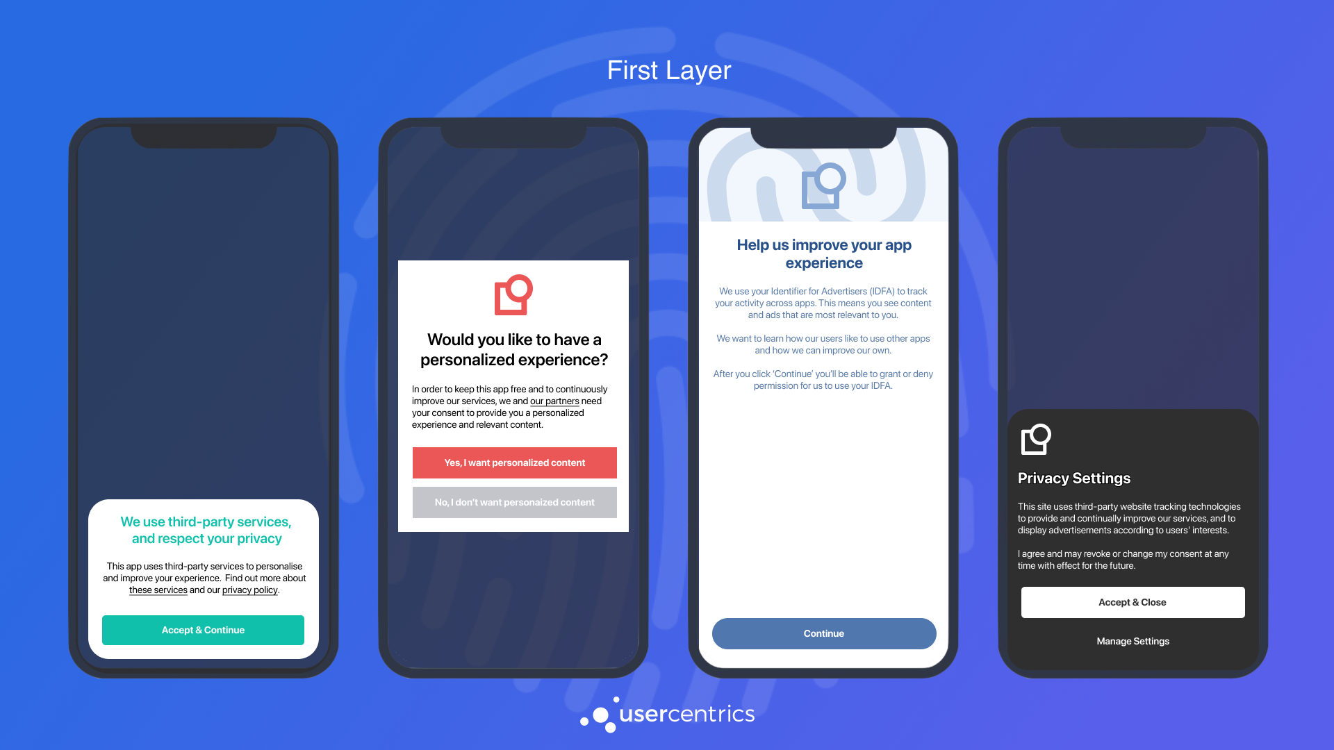
Our SDK is designed for flexibility and offers a wide range of options to customize the look and feel of your banner. We highly encourage you to be creative and transparent, your users will appreciate it.

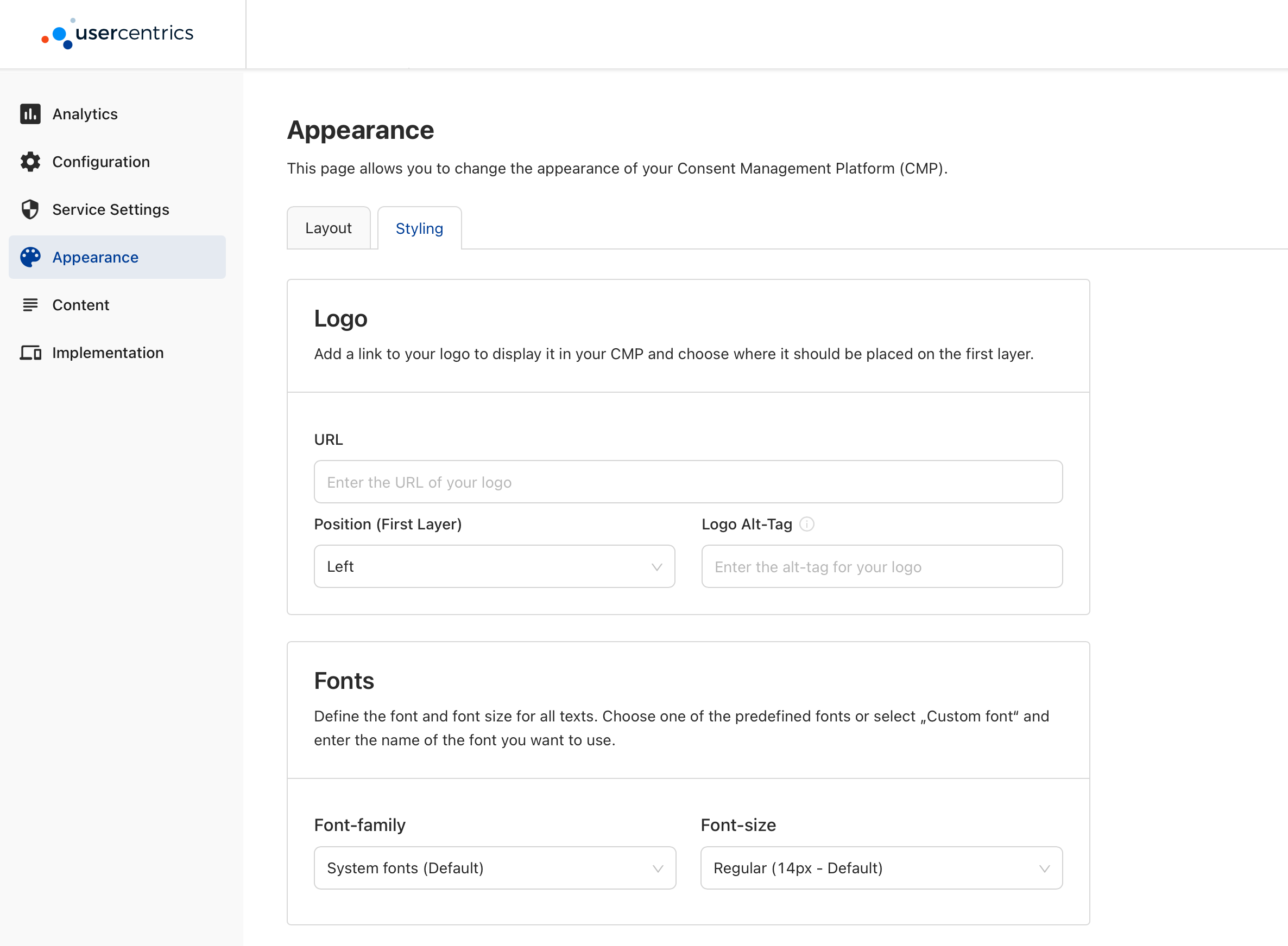
In the Appearance section of the Admin Interface, you will find a set of Styling and Layout options that you can use to customize your banner remotely. Meaning, any change that you save in the Admin Interface, will be reflected in the banner without any redeployment. These options will be used as your base configuration, and can be overwritten by the programmatic API.

Layout
Under Display Options, you will find the following options:
- Hide "Deny All" button
- Hide Language switch
Showing the Language Switch
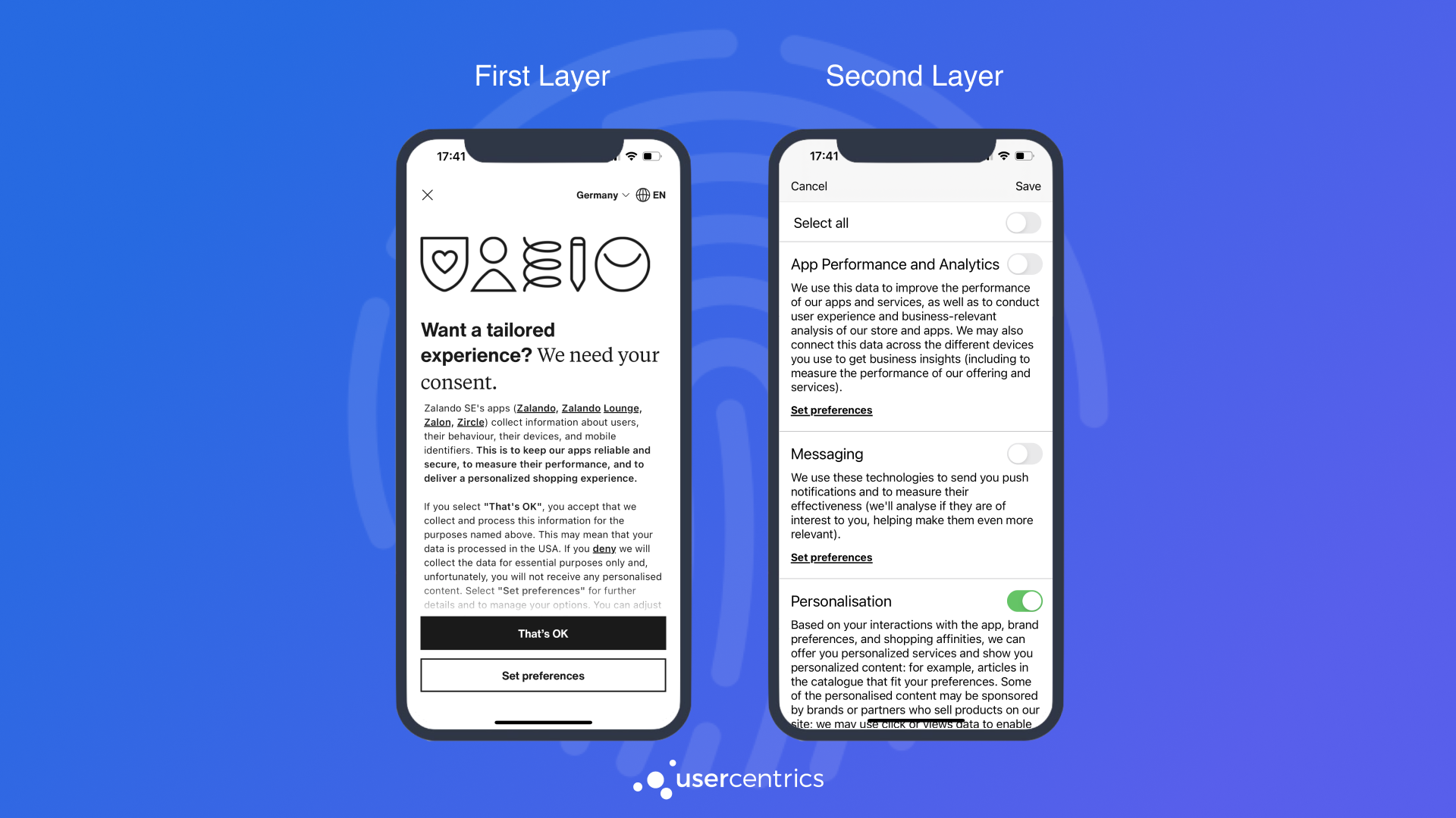
The language switch will only be shown in the Second Layer, and both of the following requirements need to be fulfilled:
- Multiple visible languages are added in the Configuration section of the Admin Interface.
- The "Hide language switch" option is disabled in the Appearance section of the Admin Interface, under the "Layout" tab.
Styling
Colors
Set individual colors by providing a specific HEX or using our color picker for the following banner elements:
- Background Color
- Tabs Color
- Text Color
- Links Color
- Background and Text Color for Buttons
- On/Off/Disabled Colors for Consent Toggles

Text Font and Size
Custom Font and text size is now only supported via programmatic customization.
Logo
Set an image to appear at the top of your banner by providing a URL:

Supported URL Image Formats
When passing a URL to fetch an image, the SDK supports: iOS: PNG and JPEG. Android: PNG, JPEG, BMP, GIF and WebP.

Starting v2.2.0, a new API is available to you, to overwrite the base customization options provided in the Admin Interface, and enable run-time configurations that will give you endless options and allow for A/B testing variants.
Compliance Note
Because the Programmatic API enables many customization options, it is important that your DPO (Data Protection Officer) reviews and approves the compliance of your design:
e.g.
- A user should always have clear options to accept, deny or save granular choices available as call to actions in the 1st or 2nd layer.
- The First Layer should always allow a path to the Second Layer.
- Calls to action should be equally prominent.
BannerSettings
This object allows you to set font and logo for both First & Second Layer.
let bannerSettings = BannerSettings(font: <BannerFont?>,
                                    logo: <UIImage?>,
                                    links: <LegalLinksSettings?>,
                                    firstLayerSettings: firstLayerSettings,
                                    secondLayerSettings: secondLayerSettings)

let banner = UsercentricsBanner(bannerSettings: bannerSettings)
banner.showFirstLayer(...) { }
val bannerSettings = BannerSettings(
    font = <BannerFont?>,
    logo = <UsercentricsImage?>,
    links = <LegalLinksSettings?>,
    firstLayerSettings = firstLayerSettings,
    secondLayerSettings = secondLayerSettings,
)

val banner = UsercentricsBanner(context, bannerSettings)
banner.showFirstLayer(...) { }
// First Layer
final response = await Usercentrics.showFirstLayer(
    ...,
    font: <BannerFont?>,
    logo: <UsercentricsImage?>,
    links: <LegalLinksSettings?>,
);

// Second Layer
final response = await Usercentrics.showSecondLayer(
    ...,
    font: <BannerFont?>,
    logo: <UsercentricsImage?>,
    links: <LegalLinksSettings?>,
);
const bannerSettings: BannerSettings = {
    font: <BannerFont?>,
    logo: <UsercentricsImage?>,
    links: <LegalLinksSettings?>
};

const options: FirstLayerOptions = {
    ...,
    bannerSettings: bannerSettings
};

const response = await Usercentrics.showFirstLayer(options);
First Layer Style Settings
This highly flexible object enables granular customization for almost every aspect of the First Layer. Just set the properties that you want to change and let other fallback to BannerSettings or Admin Interface options. This is the perfect tool to create different banner variants on run-time and enable A/B Testing.
let firstLayerSettings = FirstLayerStyleSettings(headerImage: <HeaderImageSettings?>, // Enum
                                             title: <TitleSettings?>,
                                           message: <MessageSettings?>,
                                      buttonLayout: <ButtonLayout?>, // Enum
                                   backgroundColor: <UIColor?>,
                                      cornerRadius: <CGFloat?>,
                                      overlayColor: UIColor?)

let bannerSettings = BannerSettings(firstLayerSettings: firstLayerSettings)

let banner = UsercentricsBanner(bannerSettings: bannerSettings)
banner.showFirstLayer(...) { }
val firstLayerSettings = FirstLayerStyleSettings(
    headerImage = <HeaderImageSettings?>, // Enum
    title = <TitleSettings?>,
    message = <MessageSettings?>,
    buttonLayout <ButtonLayout?>, // Enum
    backgroundColor = <@ColorInt Int?>,
    cornerRadius = <Int?>,
    overlayColor = <@ColorInt Int?>,
)

val bannerSettings = BannerSettings(
    firstLayerSettings = firstLayerSettings,
)

val banner = UsercentricsBanner(context, bannerSettings)
banner.showFirstLayer(...) { }
final firstLayerSettings = FirstLayerStyleSettings(
    headerImage: <HeaderImageSettings?>,
    title: <TitleSettings?>,
    message: <MessageSettings?>,
    buttonLayout: <ButtonLayout?>,
    backgroundColor: <Color?>,
    overlayColor: <Color?>,
    cornerRadius: <int?>,
);

final response = await Usercentrics.showFirstLayer(
    ...,
    firstLayerSettings: firstLayerSettings,
);
const firstLayerStyleSettings: FirstLayerStyleSettings = {
    headerImage: <HeaderImageSettings?>,
    title: <TitleSettings?>,
    message: <MessageSettings?>,
    buttonLayout: <ButtonLayout?>
    backgroundColorHex: <string?>,
    cornerRadius: <number?>,
    overlayColorHex: <string?>
};

const bannerSettings: BannerSettings = {
    firstLayerSettings: firstLayerStyleSettings
};

const options: FirstLayerOptions = {
    ...,
    bannerSettings: bannerSettings
};

const response = await Usercentrics.showFirstLayer(options);
Second Layer Style Settings
This object enables customization for some aspects of the Second Layer. Just set the properties that you want to change and let other fallback to BannerSettings or Admin Interface options.
let secondLayerSettings = SecondLayerStyleSettings(showCloseButton: <Bool?>,
                                                   buttonLayout: <ButtonLayout?>) // Enum

let bannerSettings = BannerSettings(secondLayerSettings: secondLayerSettings)

let banner = UsercentricsBanner(bannerSettings: bannerSettings)
banner.showSecondLayer(...) { }
val secondLayerSettings = SecondLayerStyleSettings(
    buttonLayout = <ButtonLayout?>, // Enum
    showCloseButton = <Boolean?>,
)

val bannerSettings = BannerSettings(
    secondLayerSettings = secondLayerSettings,
)

val banner = UsercentricsBanner(context, bannerSettings)
banner.showSecondLayer(...) { }
final secondLayerSettings = SecondLayerStyleSettings(
    showCloseButton: <bool?>,
    buttonLayout: <ButtonLayout?>,
);

final response = await Usercentrics.showFirstLayer(
    ...,
    secondLayerSettings: secondLayerSettings,
);
const secondLayerStyleSettings: SecondLayerStyleSettings = {
    showCloseButton: <Boolean?>,
    buttonLayout: <ButtonLayout?>
};

const bannerSettings: BannerSettings = {
    secondLayerSettings: secondLayerStyleSettings
};

const options: SecondLayerOptions = {
    bannerSettings: bannerSettings
};

const response = await Usercentrics.showSecondLayer(options);

If the available customization options in the Admin Interface and Programmatic API are not enough, and you would like to have full control over the look and feel of your banner. You can also build your own ui, and let our SDK be your data source and action delegate.