Customization
User experience is a relevant variable when collecting consent. We highly encourage you to take advantage of our customization features, in order to provide a branded and user friendly banner to your users.
Remote Customization
Use our Remote Customization options, for a quick out-of-the-box branding that covers all the basics.

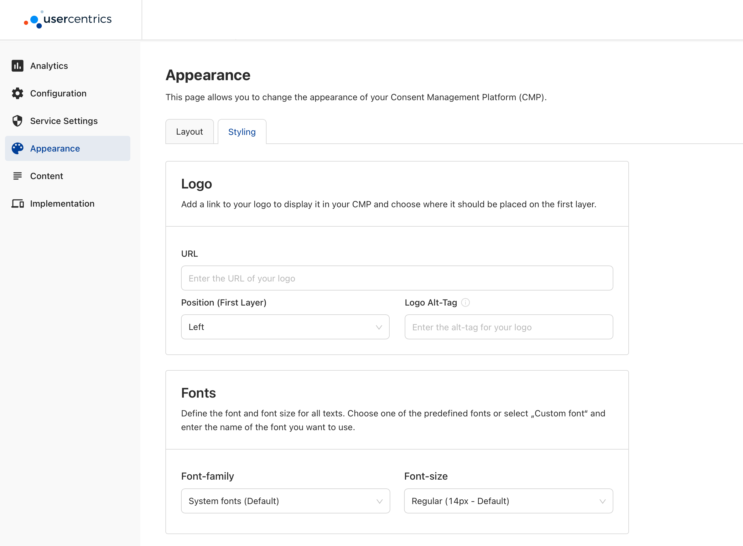
In the Appearance section of our Admin Interface, you will find the Layout and Styling tabs:
Under Display Options, you will find the following options:
- Hide "Deny All" button
- Hide Language switch
Showing the Language Switch
The language switch will only be shown in the Second Layer, and both of the following requirements need to be fulfilled:
- Multiple visible languages are added in the Configuration section of the Admin Interface.
- The "Hide language switch" option is disabled in the Appearance section of the Admin Interface, under the "Layout" tab.
Colors: Set individual colors by providing a specific HEX or using our color picker for the following banner elements:
- Background Color
- Text Color
- Links Color
- Tab Color
- Accent Color
- Button Colors
- Tabs Color
- Toggle Colors

Text Font and Size: Only supported via Programmatic Customization.
Logo: Set an image to appear at the top of your banner by providing a URL, as well as it's position:
Supported URL Image Formats
When passing a URL to fetch an image, the SDK supports: iOS: PNG and JPEG. Android: PNG, JPEG, BMP, GIF and WebP.
Any changes to the properties available here, will only take effect with a new init of the SDK and clean/updated cache.
Forcing configuration updates during Testing
You may force a configuration update by using the reset() function, or by deleting the app and installing it again. We only recommend doing this when integrating and testing the SDK.
Configuration updates in Production
The SDK caches essential data on device after the first successful init, in order to be efficient with resources and provide offline capabilities. This cache is kept for several days, depending on app usage. Which means user's will not get "Published" changes from the Admin Interface immediately, but we can guaranty changes will take effect for 100% of your user base latest within a week.
Programmatic Customization
Use our Programmatic Customization API, to create advance banner designs and run-time variants. Using this API unlocks features like A/B Testing.
Compliance Note
Because the Programmatic API enables many customization options, it is important that your DPO (Data Protection Officer) reviews and approves the compliance of your design:
e.g.
- A user should always have clear options to accept, deny or save granular choices available as call to actions in the 1st or 2nd layer.
- The First Layer should always allow a path to the Second Layer.
- Calls to action should be equally prominent.

When creating the UsercentricsUI banner, a BannerSettings property will be available for you to customize any element of the banner.
var bannerSettings = BannerSettings(generalStyleSettings: new GeneralStyleSettings(),
                                    firstLayerStyleSettings: new FirstLayerStyleSettings(),
                                    secondLayerStyleSettings: new SecondLayerStyleSettings());
General Style Settings
Style Settings values overwrite Remote Style values
| Properties | Type | Notes |
|---|---|---|
| androidDisableSystemBackButton | Bool | Disable Android system back button. |
| androidStatusBarColor | String | Android status bar color represented in HEX. |
First Layer Style Settings
| Properties | Type | Notes |
|---|---|---|
| layout | Enum | Select the Layout of the First Layer: Sheet, Popup Center, Popup Bottom, Full. |
| headerImage | Object | Customize the layout of the image at the top of your banner: .logo (default), .extended or .hidden. |
| title | Object | Customize the appearance of the title label: Text Size, Text Color and Text Alignment. |
| message | Object | Customize the appearance of the message label: Text Size, Text Color, Text Alignment, Link Text Color and Link Text Underline. |
| buttonLayout | Object | Customize the layout of the action buttons: .column (default), .grid, .row. You may also pass an array of [ButtonSettings] to define the order and appearance of the buttons. |
| backgroundColor | String | Edit the color of the First Layer background in HEX. |
| cornerRadius | Float | Edit the corner radius of the banner. |
| overlayColor | String | Edit the color of the First Layer overlay in HEX. |
| overlayAlpha | Float | Edit the alpha of the overlay color. |
Second Layer Style Settings
| Properties | Type | Notes |
|---|---|---|
| showCloseButton | Bool | Show a close button in the Second Layer to allow users to dismiss the banner without editing consent. |